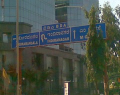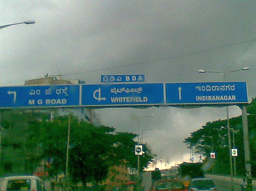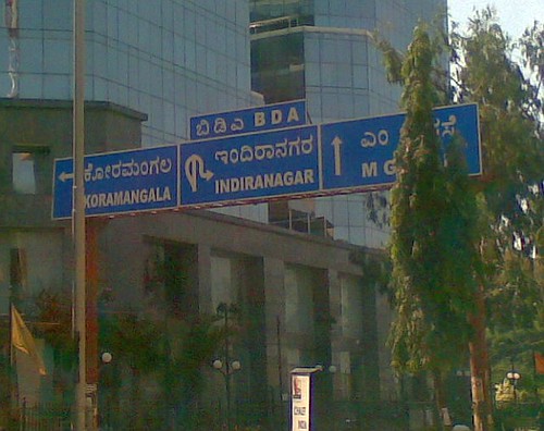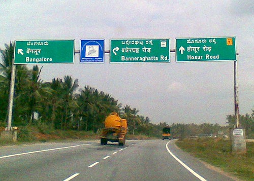
 I think its a challenge, a real one. How do you convey, via simple road signs, the so modern concept of looping road interchanges!? Try describing an interchange when giving out directions - is that a left, or a right that you take from Inner Ring Road to get on to airport road towards HAL? The road signs around such interchanges convey this confusion really well. Some samples for you:
Inner Ring Road, entering Domlur flyover towards Indiranagar. Spot the ampersand like thing next to "Whitefield":
Airport Road, heading towards the city, before Domlur flyover. A little snaky that Indiranagar direction is:
And see the NICE version, on peripheral road, near the Gottigere muddle, I mean Banerghatta Road. Cute curve:
The eagerness to be a little too precise is apparent. We are very mathematical people.


Comments
Crooked signs and Lane driving
SB,
Couldn't agree more! Especially liked the explanation "The eagerness to be a little too precise is apparent. We are very mathematical people". On a more serious note though, I think a lot of it has to do with our philosophy of lane driving in India... to the best of my knowledge there is not a road in the state that has a dedicated exit lane (I'm open to correction here) and part of the reason is that most drivers feel any lane can be used as an exit lane subject to traffic conditions, the driver's common sense and impulses. Of course most of our roads are not wide enough to cater to an exclusive turning lane. Exit lanes notwithstanding, we do not need to know the exact path I need to take before I actually turn (refer SB's Airport road flyover pics). All I need is one simple arrow that clearly indicates whether an exit lanes exists....
or not (such as the example below where ...
But even on roads where this is possible, we've seen people veer across them in the last possible minute. One that comes to mind is the St. Mark's Rd-M.G. Rd intersection. After this stretch was made a one-way one of the first things that should have been done was the road re-marked to indicate lanes dedicated to turning right onto MG Rd. in keeping with good traffic engineering principles. Another chronic problem is our lanes are often marked much too wide thus giving narrower forms of transportation (autos, Maruti omnis & Maruti 800s) adequate reason to "double-fill" a lane. Dr. ASJ has talked about this with pics from Pune.. but these could easily be Bangalore!
So where do we start... BTP? BBMP? IRC? Thoughts?
TM
Lane Disciplin
SB,
W.r.t the Indiranagar Interchange signage, to me it seems to be a case of too much information.
Because we have no lane discpline we are feeding our users with all the information at the start of the interchange. What we need to do is feed the information in bits. Hence if the correct lane is pointed out, then at every diversion a sign is required with the correct lane for each route.
For example this could how the Signage at Domlur could look:
This way the confusing and time spend in deciphering the signs is done away with. People just have to look, follow the lane and get to thier correct lane.
User Interaction Designer
Bangalore
Is anyone responsible for lane marking and directional signs?
Narayan and others,
I agree completely that we need to 'feed information in bits'. Moreover since the Airport Rd flyover has only two lanes in some stretches, signs might need to be combined. Another option is to have three different signs at three different points:
On another note though, just curious to know if someone is responsible for traffic engineering and lane markings on roads... or is it just the responsibility of the party that maintains builds the road/flyover (in the case of the Airport Rd flyover, BDA?) If not, does the IRC code indicate standards of signage and lanes/sign etc.
TM
road signs
thanks narayan and transmog
Thanks narayan and transmogrifier, thats how it should be. Direction markings should be lane based, just as you show. People get lost in debating things like, "oh nobody will follow lane disciplene, so why bother aligning signs with lanes". What a waste. Let us first get all the signs right (which BTRAC project is anyway supposed to do), and then we will tackle the disciplene angle.
And information has to be fed in bits. Just show left, right or straight. Tell me where will I go if I take the upcoming turn, don't give me information about the right or left which is three four turns ahead. And in between, some markings to show major destinations will be good (this is already in place today, some put up by BDA, BBMP, and some by Metro Cah and Carry).
Ssheragu - what makes you think we need to borrow signs from the US now. It all exists, just that police and BDa nd BBMP don't bother to follow any standards.
On a separate note, its a shame that IRC is not free, or else we would have put it up online o Praja by now.
I am thinking lets go meet Mr Praveen Sood again, and this time we wil be focussed, will only talk signages and markings, and ask him about the standards being followed by BTRAC.
More when we meet this Saturday.
BTRAC sign posting and KRDCL work
SB, ssheragu and others,
SB, I agree... it's not the standards that are missing, its the implementation of the standards that is missing. With regards to your post on the BTRAC signs, it's also hard to keep from getting disappointed when you hear about new intiatives that end up delivering just a hastily rehashed version of the same thing (old wine in a new bottle anyone?). Interestingly, although KRDCL is the implementing agency for BTRAC, when KRDCL sub-contracts the work out the results can be quite pretty (edit: Apologies, image no longer available).
Something to think about though: Is there some way we could hold the road infrastructure providers liable for failures? If access to IRC standards and we actually hold them liable for not adhering to those standards(road signage, traffic engineering) Compliance sometimes needs to be coerced if not readily given.
----
PS: FYI, ssheragu and others, I looked it up, the US Dept of Transportation has very detailed design standards for each state (http://www.fhwa.dot.gov/p...).
TM
highway signs blunders
Was on the NH4 yest and found this most confusing road sign ever..this is near Dobbspet, before Tumkur.
Dont know what the authorities wanted to convey..its sure to confuse anyone..
Also notice the board in yellow of the Tourism dept..the fonts in this are way too small for the fast vehicles on the tolled road..
Arent there standards for these signs? Or is it just pure ignorance!?
sri, that is confusing!
What you can see in this, and some BDA/BTRAC signs in the city is the enthusiasm to overload or overcommunicate. You never know, it could be a simple matter of a contractor trying to save the money on metal boards (do with one board, instead of 5 required in this case). Just need simple things as far as destination signage goes:
Colonial hangover?
Reminds me of signs you see on roads in the UK...
Those Tourism Dept. signs are aesthetically quite nice actually ... wish they were more readable.
----
TM